Drawing Tutorial: John Tenniel Inking Illustration Style
The complexity of Tenniel's work is achieved by many layers of the simple techniques I covered. It's all very delicate scribbles and crossing lines to indicate shadow.
I did this John Tenniel inspired illustration of a wolf in the forest. You can draw anything with this style, but Tenniel's technique works so well for natural backgrounds.
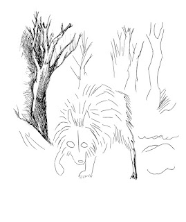
Start by blocking in the basic shapes with pencil. I use circles to block the wolf's body and some scribbly lines for the trees, rocks, and grass. Keep it loose. You can erase these later, or leave them as they will likely be covered.
Side note: Do you know the difference between your pencils? To achieve very light pressure like this, I recommend using an H pencil, such as 2H, 6H, etc. H means the lead is harder, so your lines are lighter. B means the lead is soft, so the lines are darker. The number indicates how hard or how soft. In example, an 8B is much darker (softer) than a 2B. A 6H is much lighter than a 2H. An HB, or F, are neutral pencils, just like a #2. I recommend getting a nice set of pencils (just to have on hand) in a range like these:
Anyway. I like to very loosely outline the major shapes. I inked this with Micron pens. Notice that I'm making lines contouring to the figure. I didn't just do a harsh outline all the way around the wolf, I blocked in the way his fur would grow. If you outline everything with a thick harsh line, it makes the image look very graphic. This is totally fine, if that is stylistically what you're going for. For this style, though, we want to keep the lines loose and organic. The fur lines go almost in a circle, surrounding the head. Towards the back legs/stomach, the fur starts falling down because of gravity. You can also find reference photos of wolves if you have no idea where to start!
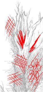
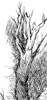
I like starting with the background first. You always work left-right if you're right-handed, and right-left if you're left-handed. The reason is you don't want to smudge your work as you go through the scene. Here, I broke down the line work I did to achieve this look. I started with the tree and the surrounding brush. As you can see by the red lines, I alternate crosshatching and scribbling to add different texture. Do not forget your light source! In this image, the light is coming from above, (like from the sun), so the tree will be darker towards the bottom. Pay attention to texture. Because I did so much crosshatching on the tree, I scribbled in circles for the brush behind the tree. Something else to note here: the further an object is, the less saturated it looks. Meaning, the darker things usually appear to be more in front. So while my tree shadows are very, very dark, I put more space in between my lines for the brush behind the trees.
Continue working your way through the background. I leave the upper sections of the trees blank to account for light, and darker towards the bottom. Make sure you're not crosshatching in the exact same directions/scribbling the same way on every tree! Alternate your textures to add interest!
Now let's start on the wolf. Remember to follow the guide we made earlier - the fur goes in loose circles around the head. I darkened the fur on his feet, back, and under his ears. Leave empty spaces to imply light hitting.
Now for the face. The fur on the face all comes from the center of the head - in between the eyes. So make sure your lines follow that pattern. It sticks up in between and around the ears, and falls more towards the ground on the sides of the head. Don't forget the eyes and nose. I like to leave a white highlight in the eyes and on the nose to imply wetness. Sometimes, if you black in the eyes completely, your creature will look dead. Don't do this to him! I also drew in the jaw line and added a few dots near the mouth to imply little hairs.
For the ground, we can get even looser. I did a lot of very quick grass-like scribbles, some crosshatching to imply shadow under the wolf, and a few more solid lines to look like rocks, holes in the ground, etc. Just scribble your grass in and darken some spots to show shadow. I did darker grass towards the very front, to the right of the wolf, and a little to the left.
Done! Hopefully this was helpful! Let me know how it turned out!


Here I am suggesting you the best site from where you can get the best quality if illustration designing work, so this place is this ilustra.co.uk/animations/ which can give you the best quality of designing work on very cheap rate without wasting your too much time.
ReplyDelete